 Mobile View Switcher | Download Switch to mobile view with one click via toolbar button.
Some of the important features of the Mobile View Switcher addon are listed below. This is followed by an overview of this addon. This summary contains few words about the addon, its function, and its features. Next is FAQ, this section is useful to get information about how this addon works in your browser. If you couldn't find a specific answer, please fill the bug report form on this page or the contact form on the homepage to let us know about your question. Following the FAQ, is the bug report form. It is designed to collect user feedbacks and bugs about this addon. Users can suggest improvements or feature requests through this form too. The next section is for submitting comments about this addon which uses the Facebook comments plugin. The last section is dedicated to reports submitted through the GitHub website. We hope the information provided on this page, could help you get all the basics you need about this addon and enable you to have a better experience with Mobile View Switcher.
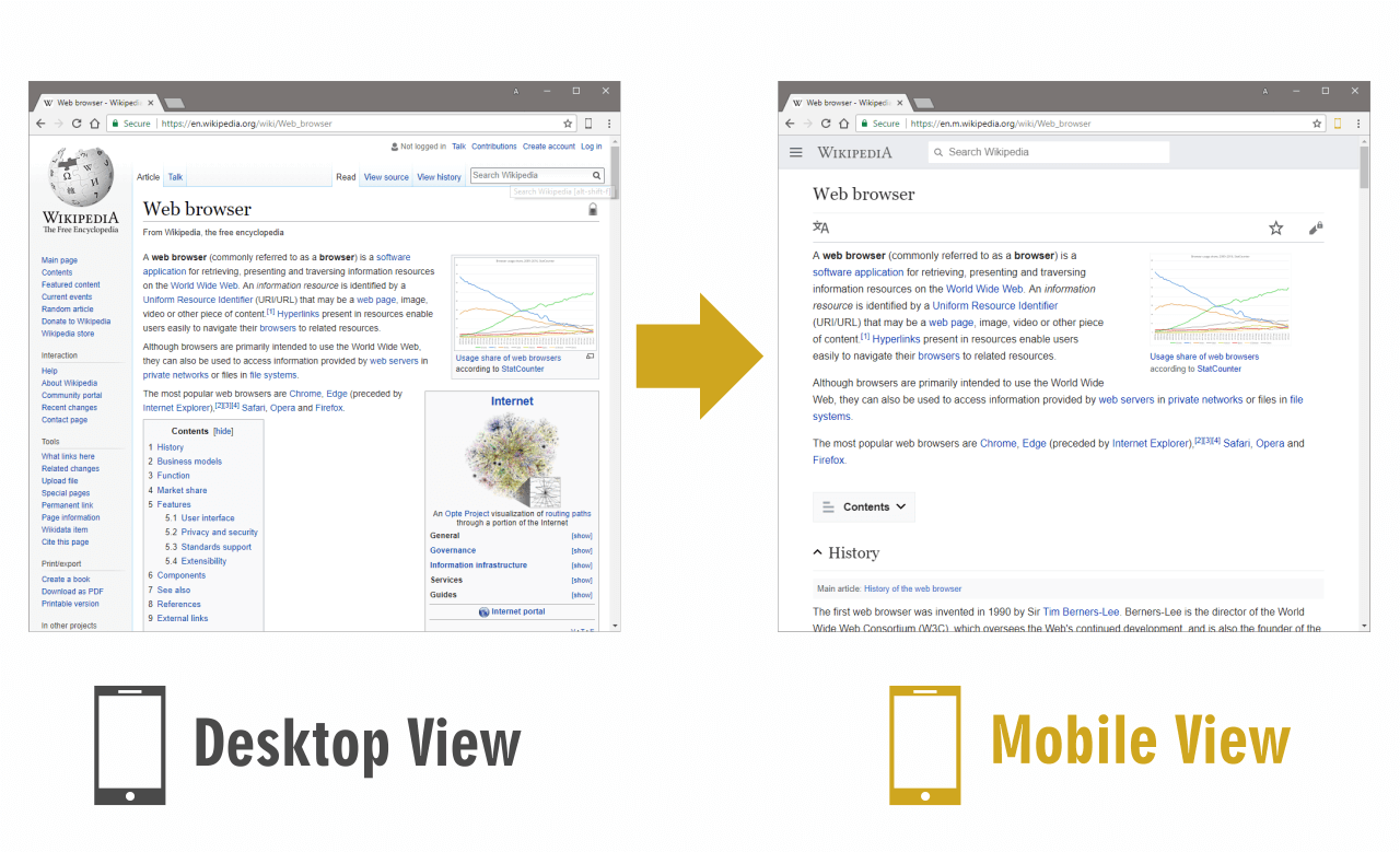
In short, Mobile View Switcher lets you view any website in mobile view with click of a button (change mobile view appearance from options page). Please check the YouTube tutorial below to get an idea of how this addon works in your browser.
5 Reasons to Use Mobile View Switcher
Allows you to switch a website to mobile view with just one click via toolbar button.
Can change the mobile view appearance (mobile device useragent string) from options page.
Toolbar button serves as ON|OFF switch to turn the addon ON or OFF.
Has keyboard shortcuts to enable or disable the addon.
Available for all browsers (Firefox, Chrome and Opera) and platforms (Windows, Linux and Mac).
YouTube Tutorial
This video gives you an idea of how the extension works in your browser.
Overview
In HTML, a mobile view refers to a design/style of a website that is suited for viewing on mobile devices such as smartphones and tablets. This typically involves designing the website in a way that makes it easy for users to navigate and use on small screens, as well as making sure that the website loads quickly on mobile devices (possibly with slower internet connections).
To create a mobile-optimized view of a website, developers can use a variety of techniques. One common approach is to use responsive design, which involves creating a single website that can automatically adjust its layout and design to fit the size of the user's screen. This can be achieved using CSS media queries, which allow developers to specify different styles depending on the width (or other CSS properties) of the screen. Another approach is to create a separate mobile version of the website using a different URL (i.e. mobile.example.com). This mobile version can be designed specifically for mobile devices, with a simpler layout and smaller images, and improved loading times. The website can then use server-side detection mechanisms to automatically redirect users to the mobile version when they browse the website from a mobile device. In either case, it is important to carefully design the mobile version of the website to ensure that it is easy to use and navigate on small screens. To reach this point, one may involve simplifying the layout and reducing the content on each page, as well as making sure that buttons and links are large enough to be easily tapped by a finger on a mobile device. In addition to using responsive design or creating a separate mobile version of the website, there are other techniques that developers can use to optimize a website for mobile devices. This can include using a mobile-first design approach, which involves designing the website for mobile devices first and then adding additional styles and features for larger screens. This can help ensure that the mobile version of the website is as simple and user-friendly as possible. Another technique is to use lazy loading, which involves only loading images and other content on the page as it becomes visible to the user. This can help improve the performance of the website on mobile devices, as it reduces the amount of data that needs to be downloaded when the page first loads. People can also use techniques such as compression and minification to reduce the size of the website's code and improve its loading performance on mobile devices. Therefore for designing in mobile view, one needs to reduce the size of CSS and JavaScript files and optimize images and other media to make them smaller without sacrificing quality. Overall, there are many different techniques that developers can use to create a mobile-optimized view of a website. By using a combination of responsive design, mobile-first design, lazy loading, and other optimization techniques, developers can create a website that is easy to use and navigate on mobile devices.
Most modern websites are designed to automatically detect when they are being accessed from a mobile device and adjust their layout and design accordingly. This is typically done using a combination of responsive design and server-side detection, which allows the website to automatically adjust its layout based on the screen size. If you want a website to load in mobile view, you can try accessing the website from a mobile device, such as a smartphone or tablet. If the website is designed to be mobile-optimized, it should automatically adjust its layout and design to fit the size of your screen. If you are using a desktop computer and want to view the mobile version of a website, you can try using a mobile emulator, simulator, or browser extension (i.e. Mobile View Switcher). These tools allow you to view the website as it would appear on a mobile device, and let you see how the mobile version of the website looks and functions. To learn more about this add-on and how it works, please read the information below.
Frequently Asked Questions
1. What is Mobile View Switcher?
Mobile View Switcher is a lite addon that let you switch a website to mobile view. Default mobile view is iPhone with iOS 11, but you can change it from the options page. Simply add a desired UserAgent to change the mobile view to your desired one. There are many websites that offer useragent strings for various devices. Simply copy and paste the desired one in the designated area in options page. Then reload any website to see the mobile view UI (while the addon is active). Toolbar button serves as ON|OFF switch to enable or disable the addon. Grey color for toolbar icon is when the addon is inactive and yellow color is for the active state. Simply click on the toolbar icon to switch states.
2. What is Mobile View in HTML?
Mobile view in HTML is a website design that is optimized for viewing on mobile devices like smartphones and tablets. This often involves designing the website to be easy to navigate and use on small screens, and ensuring that the website loads quickly on mobile devices with slower internet connections.
3. How can I download the source code for Mobile View Switcher?
To download the source code for this extension from Chrome Web Store, it is recommended to use Extension Source Downloader. With this addon, you can download the source code as a ZIP or CRX format to your machine. If you want to download the source code from the Firefox addons store, please open the firefox download link (if available) in the Firefox browser and then right-click on the - Add to Firefox - button and select - Save Link As... - item. Choose the destination folder on your machine and then save the file in XPI format. You can then rename the XPI format to a RAR or ZIP file. Some extensions may have a GitHub repo address, which you can use to download the source code as well. But, it may not be the latest version of the addon. Therefore, downloading the source code from the official web stores is the best option as it always gives you the latest version of the addon.
4. How do I work with this addon?
In order to work with this addon simply click on the toolbar button. Please note that when you first install the addon, it is inactive (grey icon). Please press on the toolbar button once to make it active (yellow color). When you press on the toolbar button the active tab will be reloaded as well, so you do not need to reload it yourself. Please note that, only the active tab will be reloaded, and all other tabs will remain intact.
5. How can I change the default mobile view appearance?
In order to change the mobile view appearance, you need to change the default useragent string (default UA is for iphone iOS 11). To do so, please open the options page and write your desired UA in the designate area. If you do not know how to find a useragent for mobile devices, please use a search engine and search for - mobile user agent string - keyword. You will find tons of useragents for mobile devices. Simply copy and paste one to the designated area in options page and reload all open tabs to see the mobile view.
6. How can I open the options page?
In order to open the options page, please head to the extensions page in your browser and click on the options button.
7. How can I uninstall this addon?
In order to uninstall this addon, please head to the extensions page in your browser, find the addon and then click on the uninstall button.
8. How can I permanently disable the addon?
In order to permanently disable the addon, please head to the extensions page in your browser, and click on the disable button. If you do not want to permanently disable the addon, please turn it off so that it does not affect any website.
9. How can I permanently disable the addon?
In order to permanently disable the addon, please head to the extensions page in your browser, and click on the disable button. If you do not want to permanently disable the addon, please turn it off so that it does not affect any website.
10. Can I add a desktop useragent instead of a mobile one?
Yes, you can add any desired useragent in the options page as long as it is a valid useragent string.
11. Is there any whitelisting feature for this addon?
No, unfortunately there is no whitelisting feature for this addon. Once you make the addon active (yellow toolbar icon color), it will work for all websites.
12. Can I activate the addon with keyboard shortcuts?
Yes, you can activate this addon with keyboard shortcuts. Please press on the (Ctrl + Shift + D) in windows machine or (Command + Shift + D) on MAC to turn the addon ON or OFF. Please note, you can change this combination from the extension page in your browser as well.
13. Where can I find the privacy policy for Mobile View Switcher?
Please read the privacy policy for this extension here.
Reporting Bugs
Your feedback goes a long way towards making this addon even better. With this feedback and bug report form, you can report bugs or suggest features/enhancements for the functionality or performance of this addon. Please note that this form will be sent to the developer(s) of this addon. You will not get an immediate or personal response at the moment. However, the developer(s) may contact you through the email address provided in this form for further clarifications or to request additional information regarding the reported bug(s).
Reviews | Discussions
Please note: keep these reviews/discussions clean, and avoid the usage of derogatory or inappropriate language or terminology in references to individuals or groups based on race, national or ethnic origin, color, religion, age, gender, etc. Do not submit bugs in your reviews, use the above bug-report section instead. Also, never post any personal information in these reviews.
mobile view
switcher
mobile
useragent
user agent switcher
Bug fixes
Improved stability
UI enhancements
Bitcoin Address
bc1q6jv832gutyz500gv2geu44t8clwdxpwd2dm9ce

Lightning Address
mybrowseraddon@getalby.com
